The type system
Use typography to present your design and content as clearly and efficiently as possible.
Type scale
The type scale includes a range of contrasting styles that support the needs of your product and its content.
The type scale is a combination of thirteen styles that are supported by the type system. It contains reusable categories of text, each with an intended application and meaning.
Headline 1 |
Font | Weight | Size | Letter spacing | Default color | |
Arial |
500 |
3.5rem / 56px |
0 |
#58595B |
||
Headline 2 |
Font | Weight | Size | Letter spacing | Default color | |
Arial |
500 |
2.75rem / 44px |
0 |
#58595B |
||
Headline 3 |
Font | Weight | Size | Letter spacing | Default color | |
Arial |
500 |
2rem / 32px |
0 |
#58595B |
||
Headline 4 |
Font | Weight | Size | Letter spacing | Default color | |
Arial |
400 |
1.5rem / 24px |
0 |
#58595B |
||
Headline 5 |
Font | Weight | Size | Letter spacing | Default color | |
Arial |
400 |
1.25rem / 20px |
0 |
#58595B |
||
Headline 6 |
Font | Weight | Size | Letter spacing | Default color | |
Arial |
400 |
0.875rem / 14px |
0 |
#58595B |
||
Type scape example:
This example type scale uses the Arial typeface for all headlines, subtitles,
body, and captions,
creating a cohesive typography experience. Hierarchy is communicated through differences in font weight
(Light, Medium, Regular), size,
letter spacing, and case.

Display type scale
Traditional heading elements are designed to work best in the meat of our page content. But sometimes we
need a larger, slightly more opinionated heading style. Then we consider using the
display heading.
|
Display 1
|
Font | Weight | Size | Letter spacing | |
Arial |
300 |
5rem / 36px |
0 |
||
|
Display 2
|
Font | Weight | Size | Letter spacing | |
Arial |
300 |
4.5rem / 30px |
0 |
||
|
Display 3
|
Font | Weight | Size | Letter spacing | |
Arial |
300 |
4rem / 26px |
0 |
||
|
Display 4
|
Font | Weight | Size | Letter spacing | |
Arial |
300 |
3.5rem / 22px |
0 |
||
|
Display 5
|
Font | Weight | Size | Letter spacing | |
Arial |
300 |
3rem / 18px |
0 |
||
|
Display 6
|
Font | Weight | Size | Letter spacing | |
Arial |
300 |
2.5rem / 14px |
0 |
||
Font size units:
The following units are used to express font size on the web.
Font size [px] |
Font size [rem] |
|---|---|
| 10px | 0.625rem |
| 12px | 0.75rem |
| 14px | 0.875rem |
| 16px | 1rem |
| 18px | 1.125rem |
| 20px | 1.25rem |
| 22px | 1.375rem |
| 24px | 1.5rem |
| 26px | 1.625rem |
| 28px | 1.75rem |
| 30px | 1.875rem |
| 32px | 2rem |
| 34px | 2.125 |
| 36px | 2.25 |
| 38px | 2.375 |
| 40px | 2.5rem |
| 42px | 2.625rem |
| 44px | 2.75rem |
| 46px | 2.875rem |
| 48px | 3rem |
| 50px | 3.125rem |
| 52px | 3.25rem |
| 54px | 3.375rem |
| 56px | 3.5rem |
| 58px | 3.625rem |
| 60px | 3.75rem |
| 62px | 3.875rem |
| 64px | 4rem |
| 66px | 4.125rem |
| 68px | 4.25rem |
| 72px | 4.5rem |
Sizing: 'px' vs 'em' vs
'rem'
When building accessible websites, we need to consider inclusion. When we use px, we don't put user preferences at the forefront. When the user zooms in or change the browser font setting, websites need to adjust to fit the user's setting. px do not scale but em and rem scales.
Sequel to this, setting the font size of the html element in percentage is recommended. Assuming the browser font size is set to 14px (i.e. the default), setting the font size of the html (root) element to 62.5% will default 0.875rem to 10px.
The Difference
Pixel (px) is a commonly used CSS unit on websites. px is not scalable, it is an absolute
unit. Change
in the value of another element does not affect the value of absolute units. The value assigned is fixed
irrespective of the user setting.
Element (em) and Root element (rem) are responsive units interpreted into
equivalent px unit by the
browser. They are relative units. Change in the value of the parent or root element affects the value of
relative units. They scale with the device. The computed pixel value of em unit is relative
to the font
size of the element being styled. This is also affected by inherited values from the parent elements
unless it is explicitly overridden by a px unit which is not subject to inheritance.
The color system
The Material Design color system can help you create a color theme that reflects your brand or style.
Usages and palettes
The color system helps you apply color to your UI in a meaningful way. In this system, you select a primary and a secondary color to represent your brand. Dark and light variants of each color can then be applied to your UI in different ways.
Theming
Color themes are designed to be harmonious, ensure accessible text, and distinguish UI elements and surfaces from one another.
Theme Primary Colors:
#0054A6
RGB: rgb(0, 84, 166)
RGBa: rgba(0, 84, 166, 1)
#00AEEF
RGB: rgb(0, 174, 239)
RGBa: rgba(0, 174, 239, 1)
#FFFFFF
RGB: rgb(255, 255, 255)
RGBa: rgba(255, 255, 255, 1)
Theme Secondary Colors:
#58595B
RGB: rgb(88, 89, 91)
RGBa: rgba(88, 89, 91, 1)
#DCDDDE
RGB: rgb(220, 221, 222)
RGBa: rgba(220, 221, 222, 1)
Anatomy
#0054a6
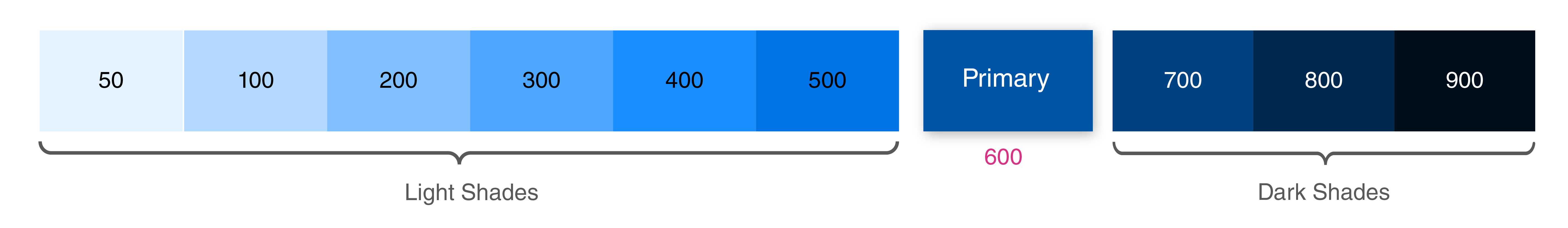
| Value | 50 | 100 | 200 | 300 | 400 | 500 | Primary | 700 | 800 | 900 |
|---|---|---|---|---|---|---|---|---|---|---|
| Bg Hex Color | #e5f2ff |
#b3d9ff |
#80c0ff |
#4da7ff |
#1a8eff |
#0074e6 |
#0054A6 |
#004180 |
#00274d |
#000d1a |
| Font Color | #58595b |
#58595b |
#58595b |
#58595b |
#58595b |
#ffffff |
#ffffff |
#ffffff |
#ffffff |
#ffffff |
#58595b
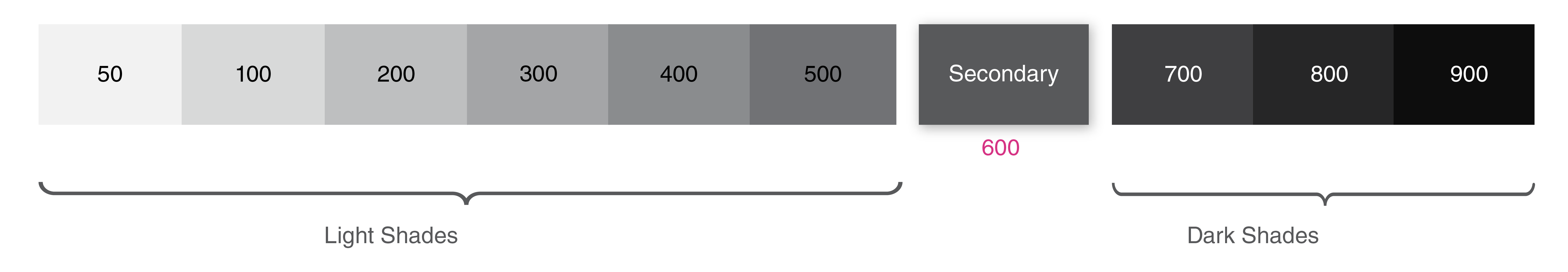
| Value | 50 | 100 | 200 | 300 | 400 | 500 | Secondary | 700 | 800 | 900 |
|---|---|---|---|---|---|---|---|---|---|---|
| Bg Hex Color | #f2f2f2 | #d8d9d9 | #bebfc0 | #a4a5a7 | #8a8c8e | #717275 | #58595b | #3f3f41 | #262627 | #0d0d0d |
| Font Color | #58595b |
#58595b |
#58595b |
#58595b |
#58595b |
#ffffff |
#ffffff |
#ffffff |
#ffffff |
#ffffff |
#00aeef
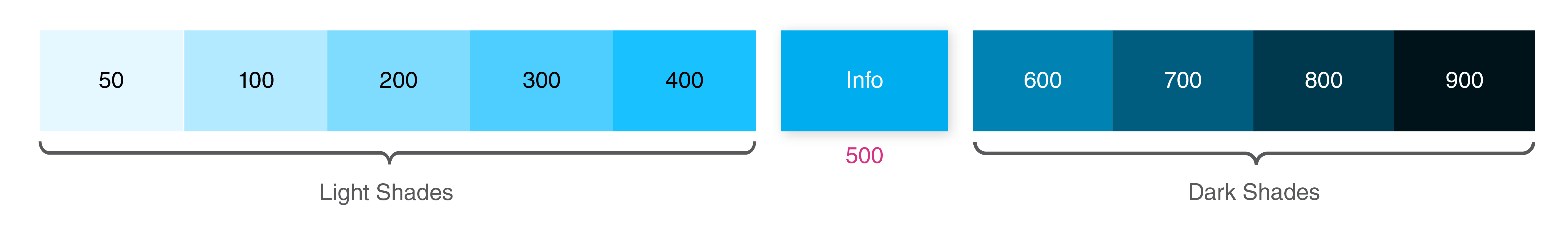
| Value | 50 | 100 | 200 | 300 | 400 | Info | 600 | 700 | 800 | 900 |
|---|---|---|---|---|---|---|---|---|---|---|
| Bg Hex Color | #E5F8FF | #B3EAFF | #80DCFF | #4DCEFF | #1AC1FF | #00AEEF | #0082B3 | #005D80 | #00384D | #00131A |
| Font Color | #58595b |
#58595b |
#58595b |
#58595b |
#58595b |
#ffffff |
#ffffff |
#ffffff |
#ffffff |
#ffffff |
Font color:
#58595b
RGB: rgb(88, 89, 91)
RGBa: rgba(88, 89, 91, 1)
Input border color:
#DCDDDE
RGB: rgba(220, 221, 222)
RGBa: rgba(220, 221, 222, 1)
Link color:
#0054a6
RGB: rgb(0, 84, 166)
RGBa: rgba(0, 84, 166, 1)
Coats Digital Design Language Material Design Color Shades:
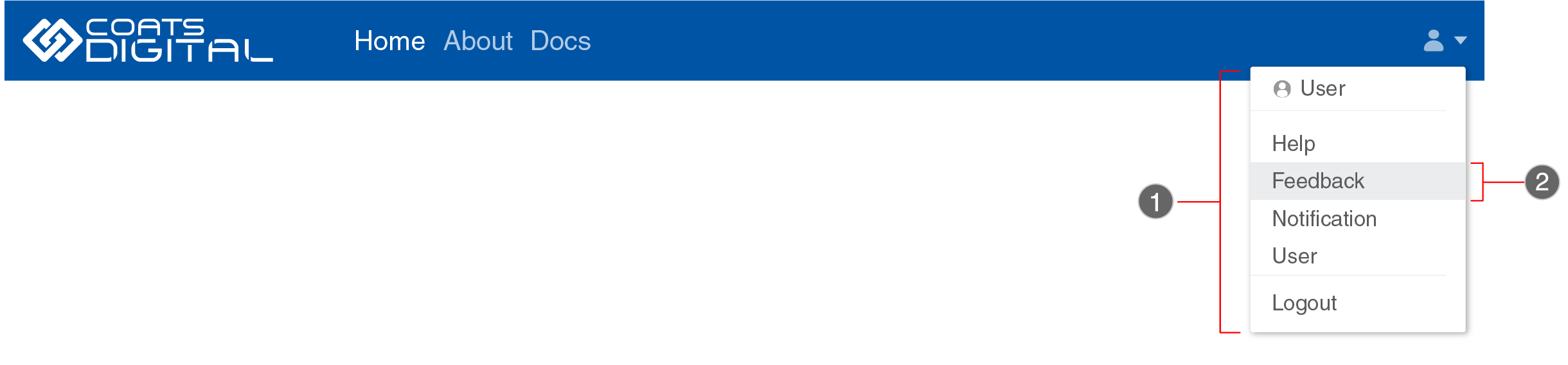
Headers
Headers are compositions that extend standard navbar functionalities. They contain additional components like sub-navbar, or image covers which serve as a containers for extra navigation elements - usually links, forms, or call-to-action buttons.
Navigation bar
The top app bar provides content and actions related to the current screen. It’s used for branding, screen titles, navigation, and actions.
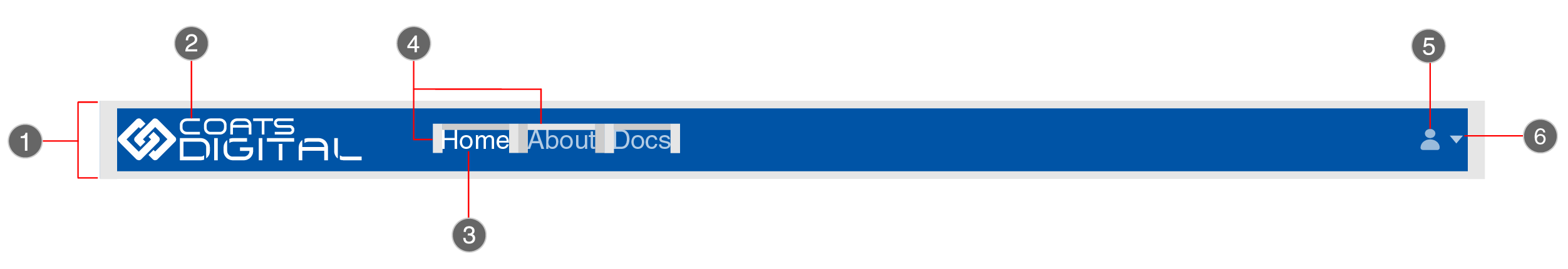
- Background color:
#0054a6 - Primary:
#0054a6 - Light:
#bcbec0 - Brand Gradient:
#00aeef6a6 - Border radius:
0 - Height:
56px - Height:
32px - Width:
Auto
-
1. Header container -
-
2. Logo
- Font size:
14px - Color:
#58595b - Left & right padding:
.5rem/8px - Top & bottom padding:
1rem/16px
-
3. Navigation items
-
4. Padding
-
5. User icon
-
6. Dropdown menu icon
The width of the dropdown menu should be according to the size of the menu item. And the
required tabbing
should have Padding Top and Bottom as 0.5rem or 8px and
the Padding
Right and Left as 1rem or 16px which ever is applicable.
- Height and width will adust with the dropdown items
- Left & right padding:
.5rem/8px - Top & bottom padding:
1rem/16px
-
1. Heigh and width of dropdown menu
-
2. Dropdown items padding
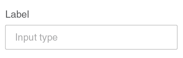
Text fields
Text fields let users enter and edit text. Text fields allow users to enter text into a UI. They typically appear in forms and dialogs.
Types
Text fields come in two types:
- Filled text fields
- Outlined text fields
Both types of text fields use a container to provide a clear affordance for interaction, making the fields discoverable in layouts.
Filled text fields
Outlined text fields
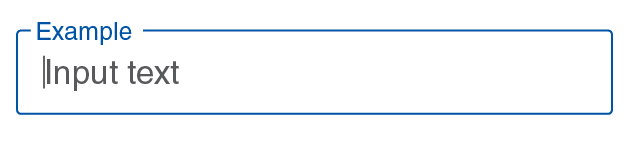
Both types of text fields provide the same functionality, so the type of text field you use can depend on style alone.
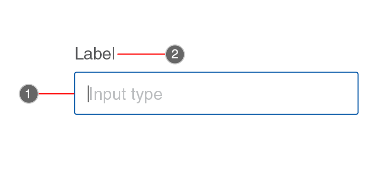
Anatomy - Filled text field
Filled text field

- Border color:
#bdbdbd - Border radius:
2px - Font size:
14px - Color:
#bcbec0 - Font size:
14px - Color:
#58595b - Left & right padding:
.75rem - Top & bottom padding:
.45rem
-
1. Input container -
-
2. Input text
-
3. Label text
-
4. Padding
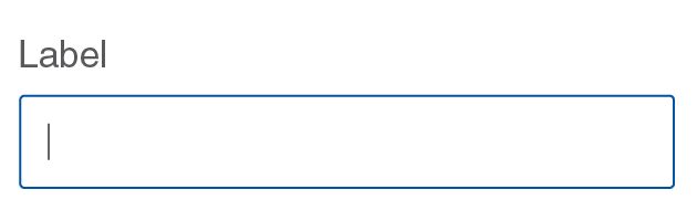
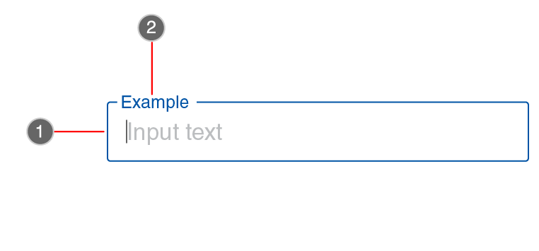
Filled text field - focus
- Border color:
#0054a6 - Font size:
10px - Color:
#58595b
-
1. Input container focus -
-
2. Input label text -
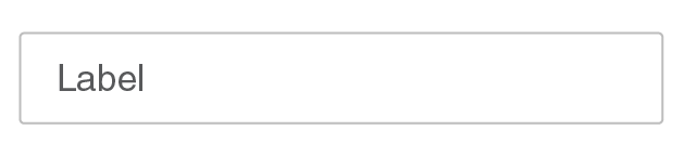
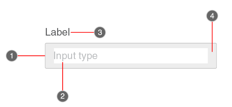
Anatomy - Outlined text fields
Oulined text field
- Border color:
#bdbdbd - Border radius:
2px - Font size:
14px - Color:
#bcbec0 - Font size:
14px - Color:
#58595b - Left & right padding:
.75rem - Top & bottom padding:
.45rem
-
1. Input container -
-
2. Input text
-
3. Label text
-
4. Padding
Outlined text field - focus
- Border color:
#0054a6 - Font size:
10px - Color:
#0054a6
-
1. Input container focus -
-
2. Input label text -
Buttons
Buttons are clickable elements that are used to trigger actions. They communicate calls to action to the user and allow users to interact with pages in a variety of ways. Button labels express what action will occur when the user interacts with it.
Usage
Buttons communicate actions that users can take. They are typically placed throughout your UI, in places like:
- Dialogs
- Modal Windows
- Forms
- Cards
- Toolbars
When to use?
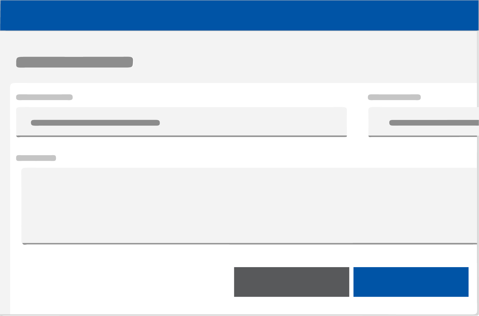
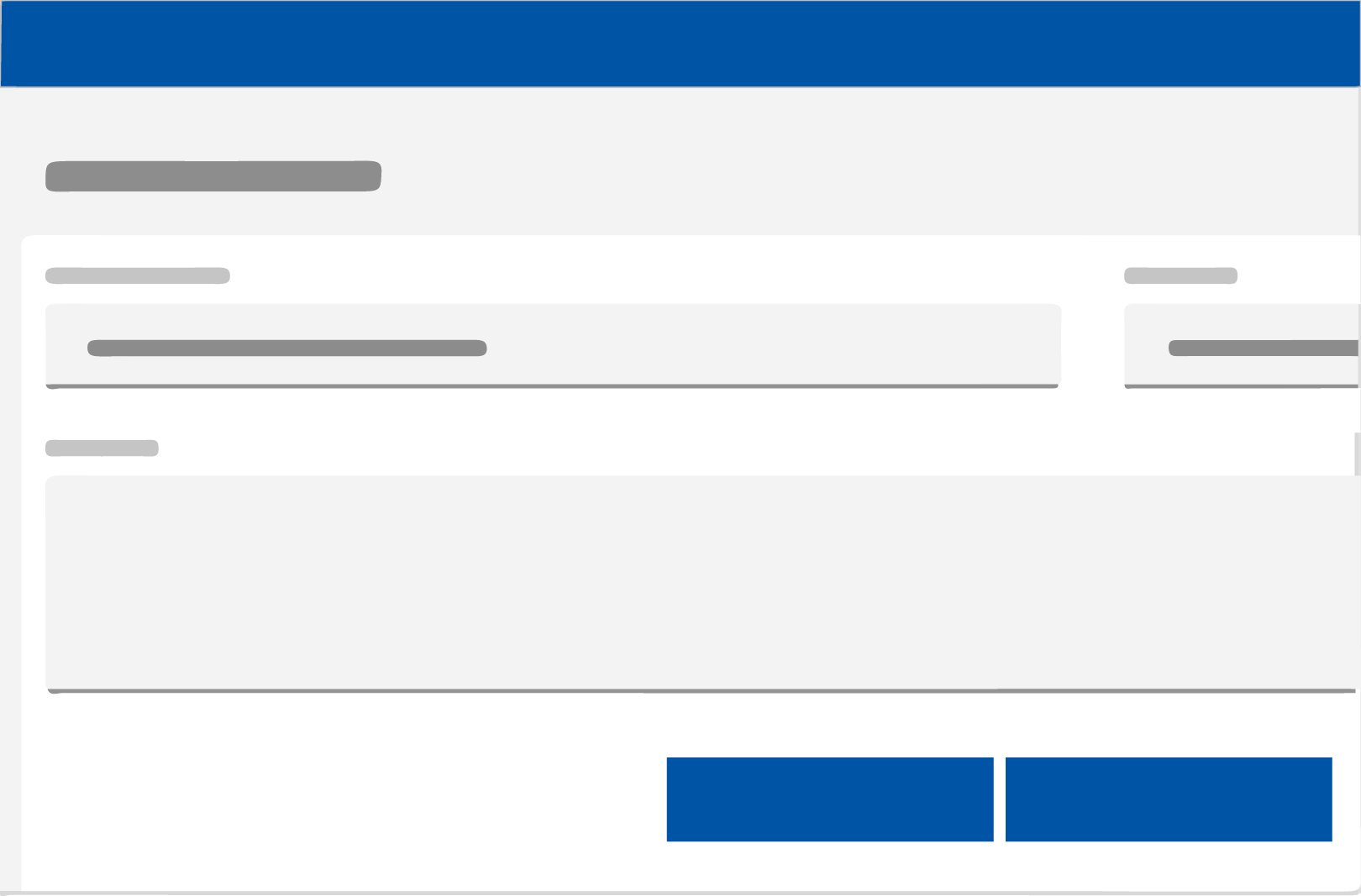
Use buttons to communicate actions users can take and to allow users to interact with the page. Each page should have one primary button, and any remaining calls to action should be represented as lower emphasis buttons.
When not to use?
Do not use buttons as navigational elements. Instead, use links
when the desired action is to take the
user to a new page.
Types of button
- Contained button (High emphasis)
- Outlined button (Medium emphasis)
- Text button (Low emphasis)
- Toggle button
Any software or application can show more than one button in a layout at a time, so a
high-emphasis button can be
accompanied by medium-emphasis and low-emphasis buttons that perform less
important actions. When using
multiple buttons, ensure the available state of one button doesn’t look like the disabled state of
another.
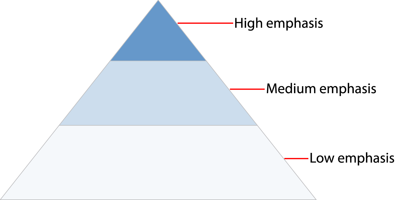
A button’s level of emphasis helps determine its appearance, typography, and placement.
Contained button
Contained buttons are high-emphasis, distinguished by their use of elevation and fill.
They
contain
actions that are primary to the application. For the principal call to action on the page. Primary
buttons
should only appear once per screen (not including the application header, modal dialog, or side
panel).
This high-emphasis button commands the most attention.
As a general rule, a layout should contain a single high-emphasis button that makes it
clear that other
buttons have less importance in the hierarchy.
A high-emphasis button can be accompanied by medium- and
low-emphasis buttons that perform less important
actions. Keep in mind that you should only group together calls to action that have a relationship to
one
another.

Do use high-emphasis and medium-emphasis buttons in a button group.
Do not use two high-emphasis buttons in a button group.
Alignment
Alignment refers to whether the buttons are aligned to the right or the left of a window, container, or layout. Buttons are unique, more so than any other component, in that their alignment depends on where they appear and whether or not they’re contained within another component.
As a general rule, on full-page designs, the primary button is on the left side of the page. When the browser window is large and the user is scrolling to read, it’s best to have the primary button where the user’s attention has been focused all along. Whereas in wizards, where a user is progressing through a series of steps or dialog windows, the primary action traditionally sits at the bottom right. Buttons within components such as notifications, search fields, and data tables are also right-aligned.
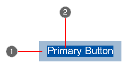
Anatomy
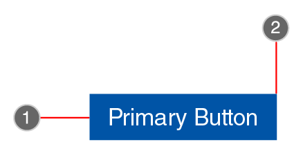
- Background color:
#0054a6 - Font color:
#FFFFFF - Border radius:
0
-
1. Primary button container -
-
2. Border radius
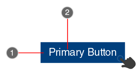
- Padding top and Padding bottom:
0.5rem - Padding left and Padding right:
1rem - Font size:
default font size of root
-
1. Buttons padding -
-
2. Buttons font size
- Background color:
#003f7d - Font size:
default font size of root - Font color:
#FFFFFF
-
1. Primary buttons hover -
-
2. Buttons font size
Outlined button
Outlined buttons are medium-emphasis button. These are used for more emphasis than text
buttons due to the stroke. For less prominent, and
sometimes independent, actions. Outlined buttons can be used in isolation or paired with a primary button
when there are multiple calls to action. Outlined buttons can also be used for sub-tasks on a page where a
primary button for the main and final action is present.
The outline button style removes all background images or colors from a button and gives it a lighter look.
The outline style buttons can be used for various purposes, for example:
- Indicating the secondary action complementing the primary action.
- If you have many buttons then it may help in reducing the “noise”
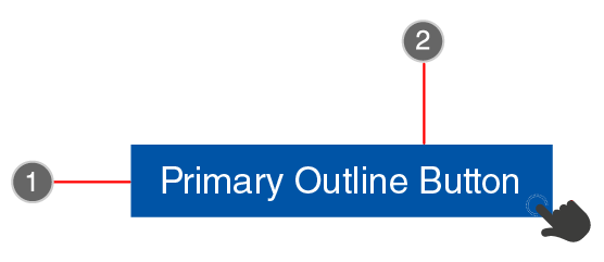
Anatomy
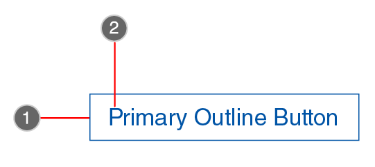
- Container border color:
#0054a6 - Font size:
default font size of root - Font color:
#0054a6
-
1. Primary outline container -
-
2. Outline buttons font size
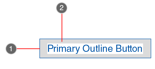
- Container border color:
#0054a6 - Padding top and Padding bottom:
0.5rem - Padding left and Padding right:
1rem
-
1. Primary outline container -
-
2. Outline buttons padding
- Background color:
#0054a6 - Font size:
default font size of root - Font color:
#FFFFFF
-
1. Primary outline hover container -
-
2. Outline buttons hover font -
Text button
Text buttons are typically used for less important actions. This tpe of buttons should never be used to change the state of an application. This means that clicking on a link should not add, change, or delete any data on the screen, So, a delete action should never be a link, nor should a save action.
Text buttons or links should never be used to change the state of an application. This means that clicking on a link should not add, change, or delete any data on the screen, So, a delete action should never be a link, nor should a save action.
Text buttons hurt mobile usability
The usability standards for buttons are higher for mobile apps than desktop apps. With a smaller screen and finger navigation, mobile buttons must be easy to tap, read, and recognize. Most solid buttons meet this standard, but text buttons rarely do. Before you use text buttons on your app, here’s what you should know.
A finger is larger than a mouse cursor. Placing it over a smaller target feels awkward for users. Their finger covers the button’s text with no visual cue to confirm if the action registered.
Anatomy
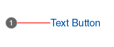
- Font color:
#0054a6
-
1. Text button -
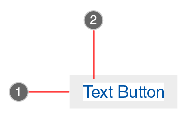
- Padding top and Padding bottom:
0.5rem - Padding left and Padding right:
1rem
-
1. Text buttons container.
-
2. Text button padding -
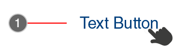
- Font size:
default font size of root - Font color:
#003f7d
-
1. Text buttons hover.
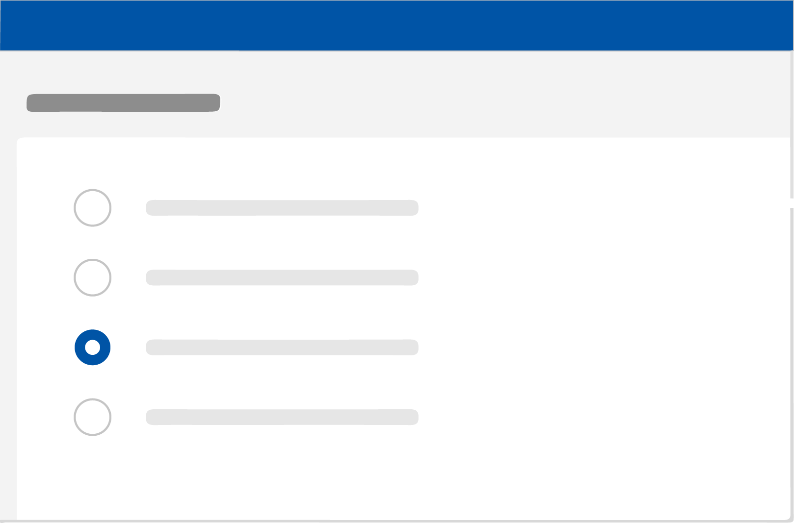
Radio buttons
Radio buttons are used when there is a list of two or more options that are mutually exclusive and the user must select exactly one choice. In other words, clicking a non-selected radio button will deselect whatever other button was previously selected in the list.
Usage
Use radio buttons to:
- Select a single option from a list
- Expose all available options
When to use radio buttons?
Radio buttons should be used instead of checkboxes if only one item can be selected from a list.
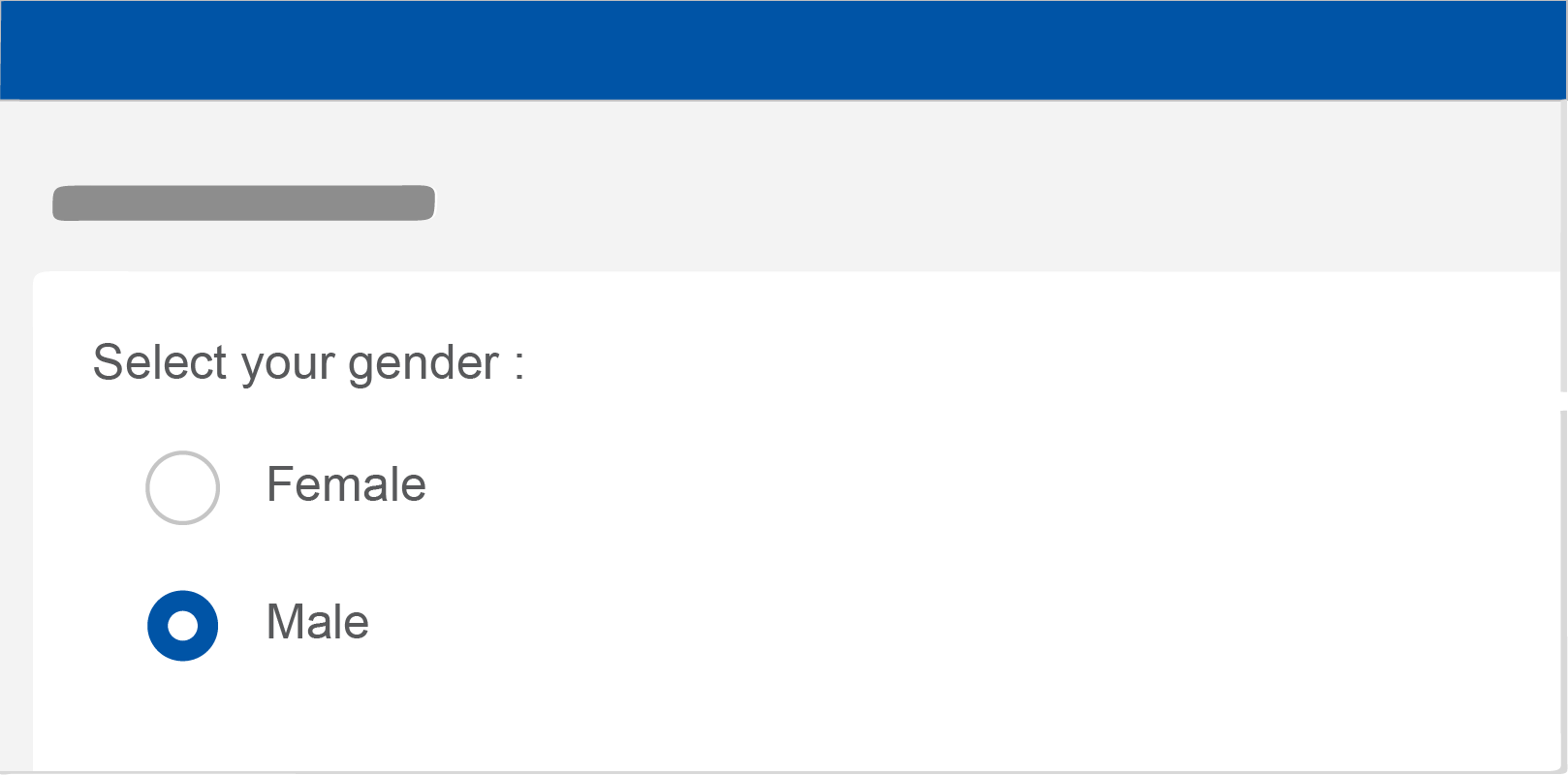
Do use radio buttons when only one item can be selected from a list.

Do not use checkboxes when only one item can be selected from a list. Use radio buttons instead.
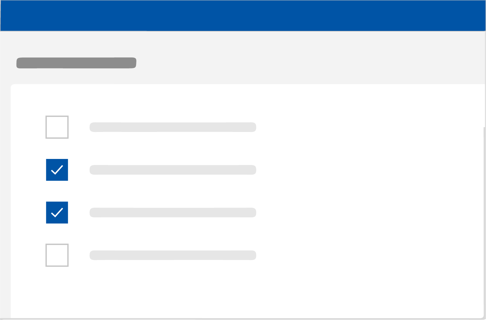
Checkbox
Checkboxes are used when there are lists of options and the user may select any number of choices, including zero, one, or several. In other words, each checkbox is independent of all other checkboxes in the list, so checking one box doesn’t uncheck the others. A stand-alone checkbox, or a toggle can be used for a single option that the user can turn on or off.
Usage
Use checkboxes to:
- Select one or more options from a list
- Present a list containing sub-selections
- Turn an item on or off in a desktop environment
When to use checkboxes
Checkboxes should be used instead of switches if multiple options can be selected from a list.
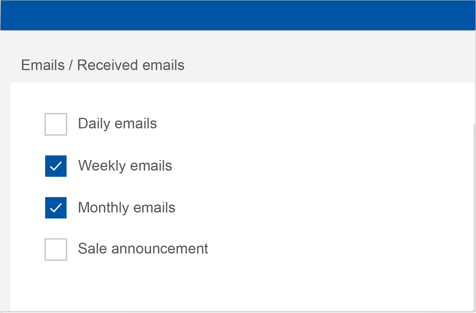
Do: Checkboxes let users select one or more options from a list. A parent checkbox allows for easy selection or deselection of all items.
Do not: If a list consists of multiple options, don't use switches. Instead, use checkboxes. Checkboxes imply the items are related, and take up less visual space.
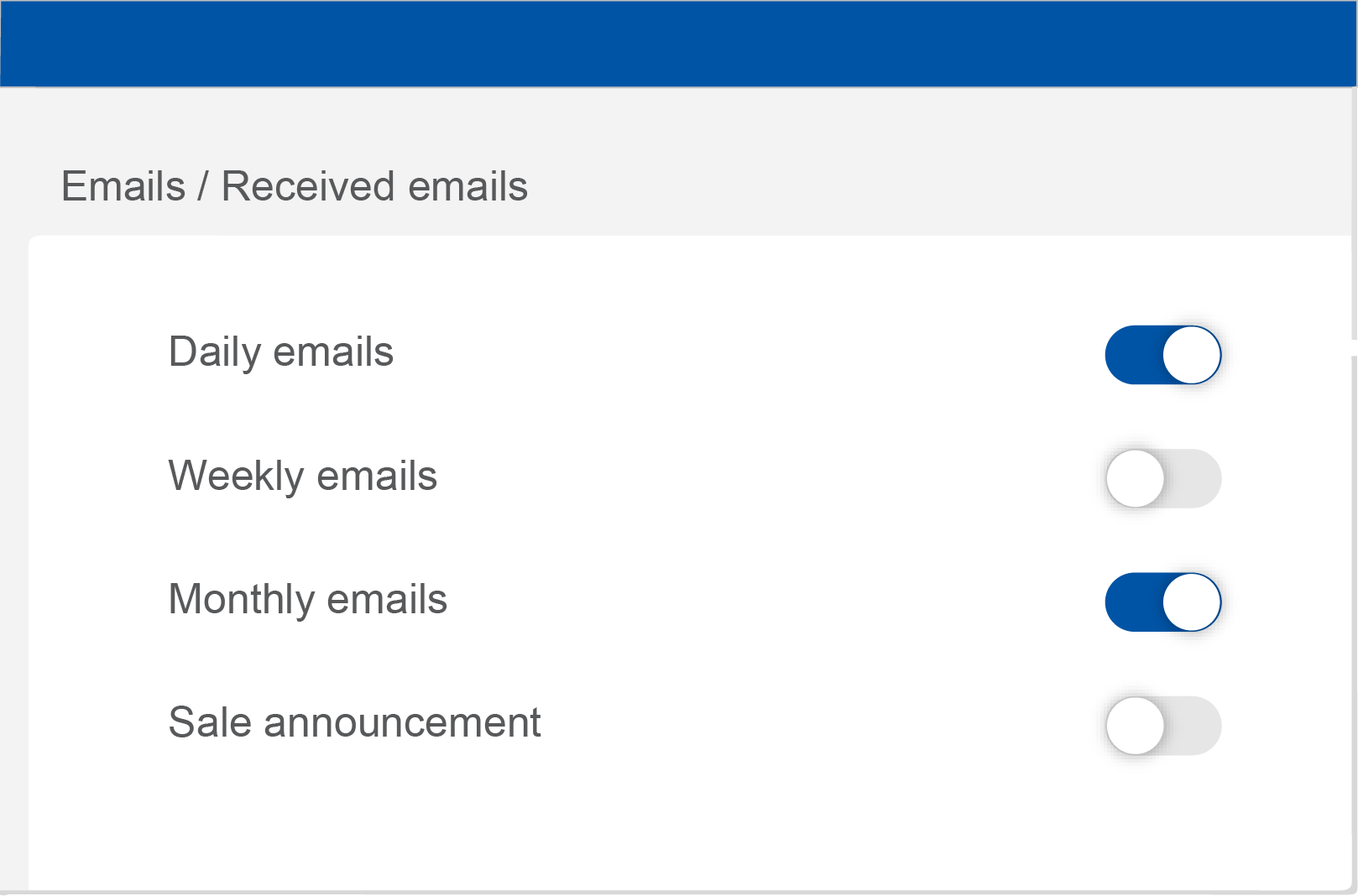
Switches
Switches toggle the state of a single item on or off.
Usage
Switches are the preferred way to adjust settings on mobile.
Use switches to:
- Toggle a single item on or off, on mobile and tablet
- Immediately activate or deactivate something
When to use switches
Switches should be used instead of radio buttons if each item in a set can be independently controlled. List of phone settings. Each item has a radio button.
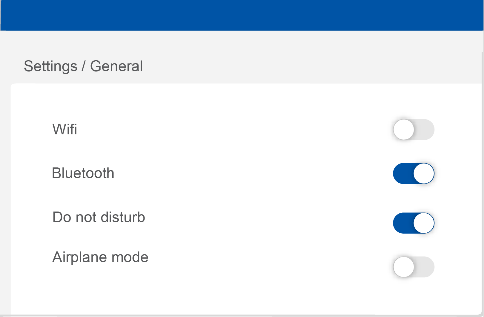
Do: Use switches to turn an item on or off, especially on mobile instead of a checkbox.
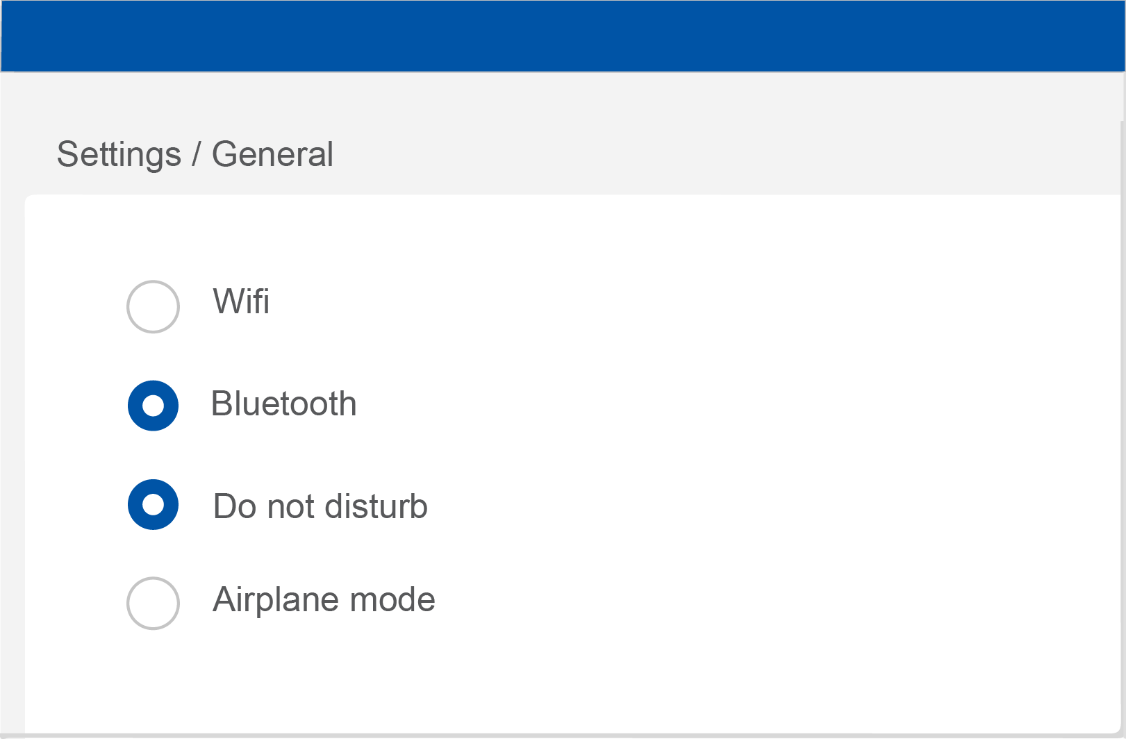
Do not: Use radio buttons to toggle items on or off. Radio buttons convey that a set of items are options, and that only one can be selected at a time. Instead, use switches.